Overview
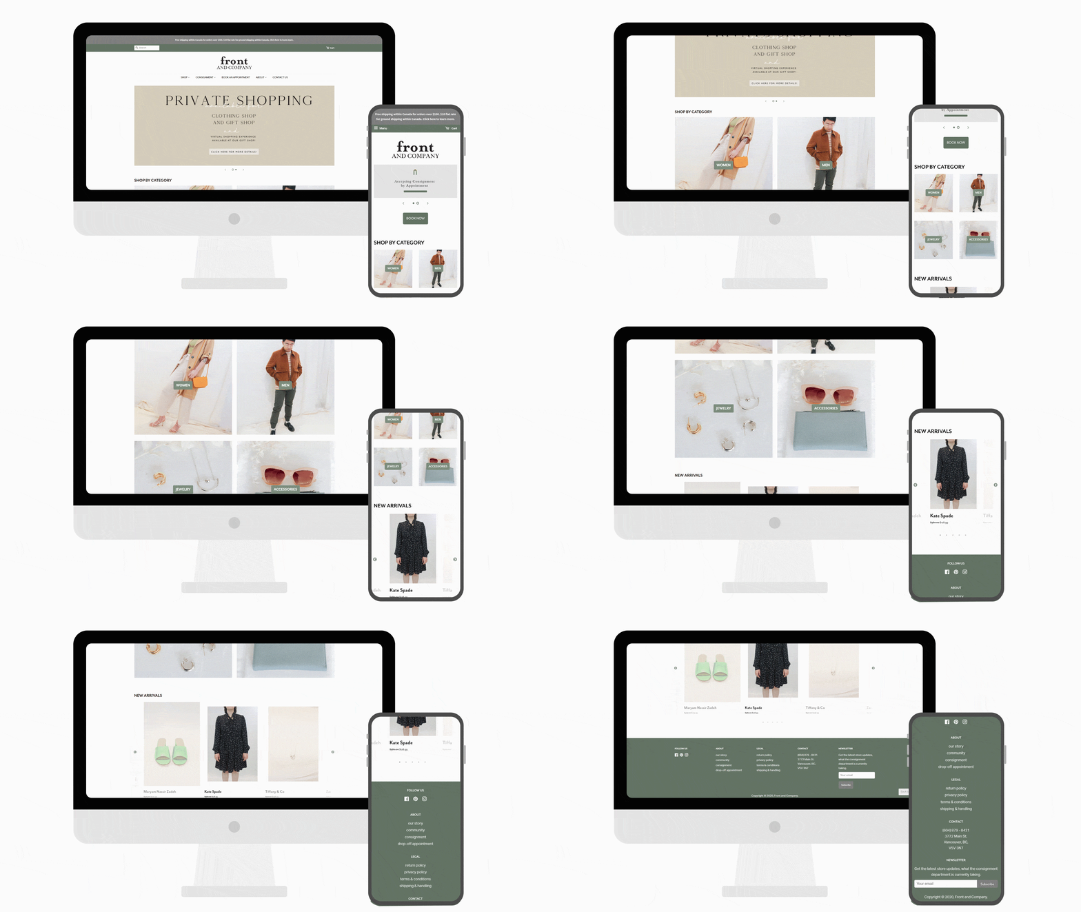
Front & Company is a Vancouver based consignment store which started off as a small store selling consignment clothing, antiques, and vintage jewelry. Now they have grown into three storefronts, taking up half a block. They currently offer a variety of gift and home decor items, new and consignment jewelry, clothing, and footwear. As they continue to grow, they needed someone to help to expand their online presences and provide more options for their customers and consignors.
For the 8 months at Front I was able to work on two projects. During the first four months working at Front & Company, I helped them research, plan out, implement, and train staff on a new inventory and point-of-sales system. Within that term, I was able to problem solve a lot of problems that the company would and are facing. With that experience it has prepared me to help them rebuild their website for my last four months at the company.
Project Details
Type
Internship
Role
Front-end Web Development, Web Design, UX Design
Tools & Skills
Liquid/HTML, SCSS/CSS, Javascript, Illustrator

Context
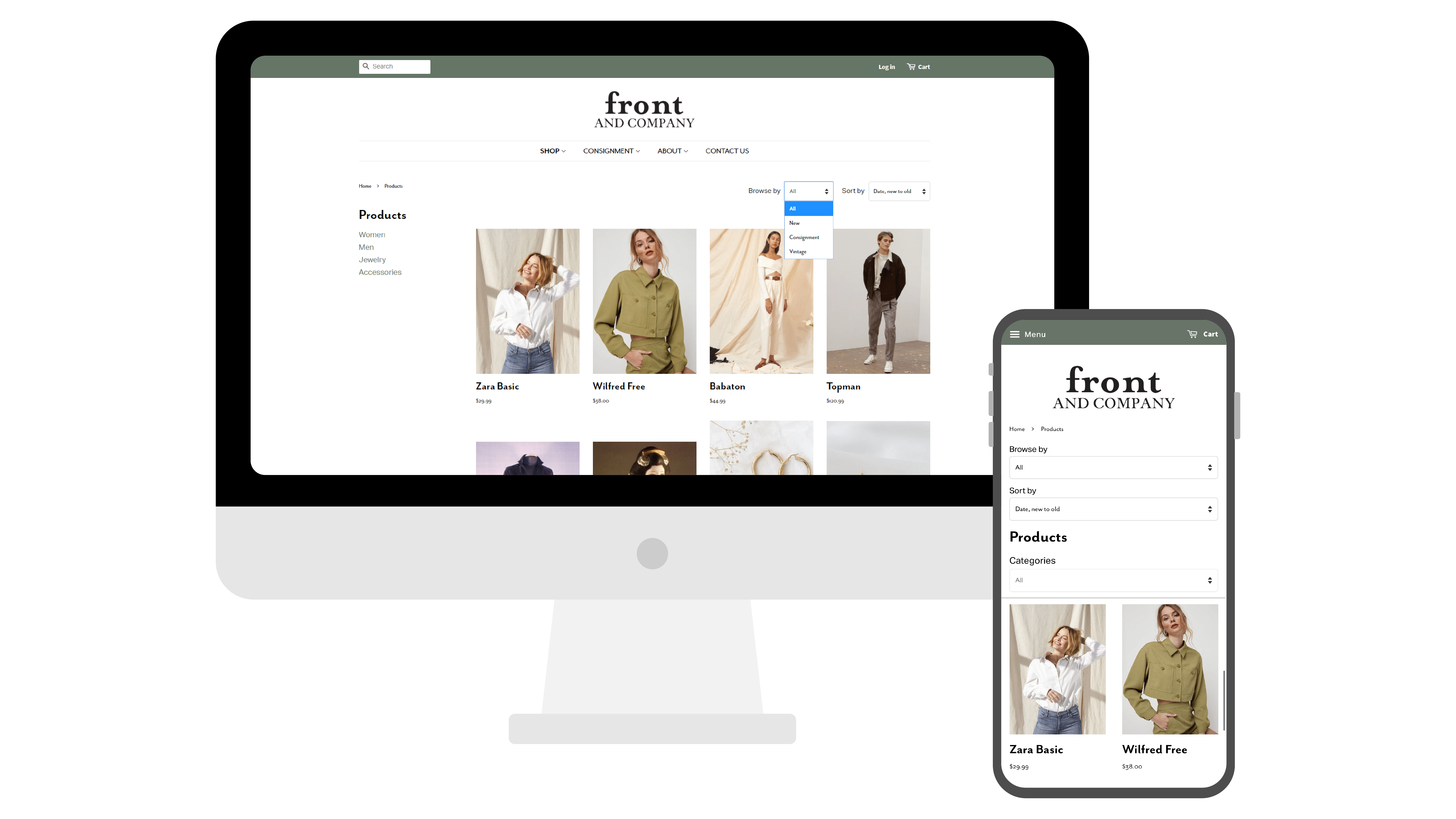
With my understanding and experiences at Front & Company of how they operate and organize their inventory, I was tasked with building them a new website. It needed to be well integrated with their current inventory system, meaning it was best suited to be ran off Shopify. We chose to go with Shopify because we wanted a seamless background interaction between our inventory system and website. Our inventory would be uploaded from our system to the website without needing to do double the work. However, as time progressed with us building up the website, we ran into a few major challenges. One of the larger challenges we faced was creating organization and good user experience on the frontend for customers. We wanted to give them an enjoyable experience when exploring and purchasing our products. The solution that I created was by using the defined attributes we had for different items from our inventory system and the “automatic collections” function from Shopify. With those two features working hand in hand, we were able to provide our future customers with the best experience possible.

Process
During the initial stages, I worked alongside my supervisor and the social media team in creating a new versatile font pack and colour pallet. We had a minor miscommunication with the social media team, in what fonts we were using, however, to combat this problem we ended up using the best of both font packages. Afterwards, I looked through their old website and produced a new navigation menu, based off my understanding of what was needed for this new site.
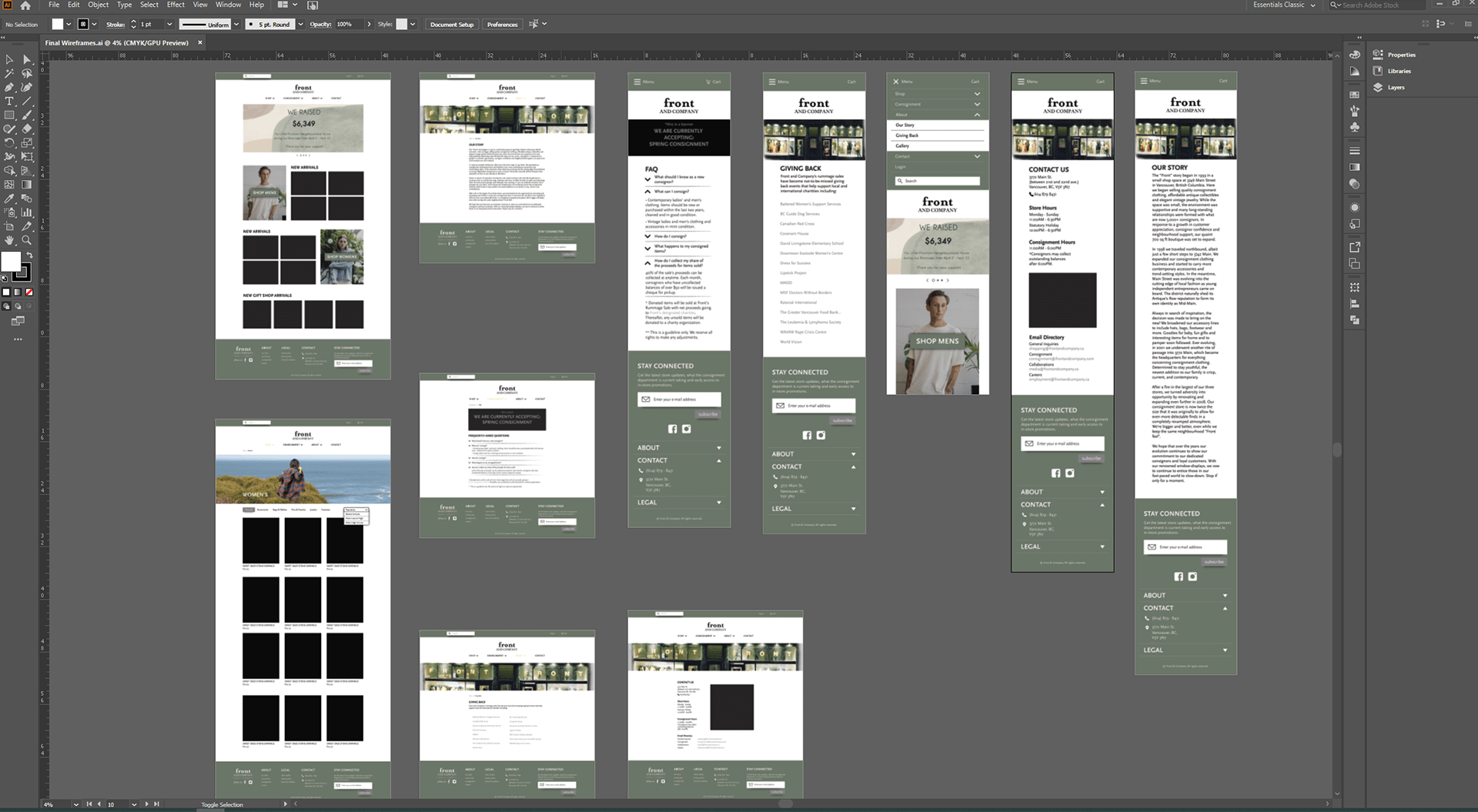
With that taken care of, I started to ideate and generate possible website layouts (wireframes) in Illustrator with the font and colour package. Having all those elements sorted out and approved, I started working and coding the website.
With the mock-ups completed, I began coding out the pages. During this process I kept in mind that this company doesn’t have an employee that known how to code, hence I tried to make most of the editorial settings user friendly and require minimal to no need to modify the backend code. When most of the pages and sections coded out, I began to input the graphics and written content that I obtained from our social media team. Finally, having most of the website completed I began user testing, receiving feedback, and creating revisions.

Final Thoughts
Throughout this project, I was introduced to many new roles and challenges, however they all helped me grow as a student, designer and person. I learned a lot about project management through my supervisor, as she was the person leading this project. As a designer, I was able to develop a lot of skills and knowledge that I had, yet never got to focus on in my past projects. For instance, user experience, I was able to apply it for the clients of the company and the company itself. This project has helped me work on my interpersonal skills; towards the last half of the project I began to work closer with the social media team. They were very focused on visual design and appearance; I was very focused on user experience. After, our discussion I did some research on how other websites combat some of these problems. Then, I was able to implement a solution which pleased both parties. Overall, this coop experience was very rich in content and it has widened my scope in what type of design I would like to pursue in the future.