Overview
Obsolete is made up of multiple tangible user interfaces that are based off different eras of music players. These tangible user interfaces make up an interactive art exhibit where the concept of planned obsolescence is portrayed through the passing of each music player.

Project Details
Type
Company Application
Role
Frontend Software, UX UI Designer
Tools & Skills
Figma, Google Flutter
Forms
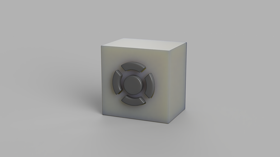
For our first TUI, we based it off Dieter Ram’s Braun RT20 radio. This TUI represented an old school radio with very limited functionality, it only received one channel and had a volume knob. It is made from metal and perceived a very durable long-lasting design.

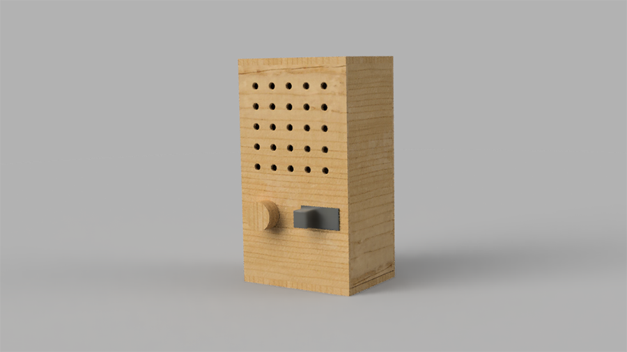
The second TUI was inspired off another Dieter Ram music player, the T3 pocket radio. We choose to bring up another level of engagement. By introducing the ability to toggle between two audio channels. This form was built out of wood, a bit less durable material than the previous material.

The second TUI was inspired off another Dieter Ram music player, the T3 pocket radio. We choose to bring up another level of engagement. By introducing the ability to toggle between two audio channels. This form was built out of wood, a bit less durable material than the previous material.

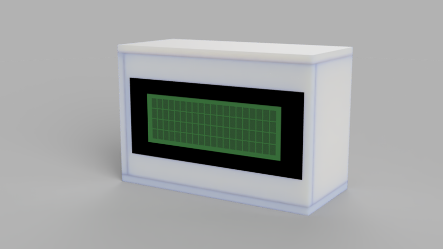
The final TUI is alike a smartphone similar to an iPhone. This player has all the functionalities of the previous player, however not in the form of any buttons instead the player is all gestured based and the changes is displayed through the LCD screen of the player. Through tilting the device forward and backwards the volume can be mapped louder and quieter. By tilting the device side to side the song can be changed. This form is made out of paper, one of the perceivable fewer durable materials in building.

User Experience & Interaction
At the beginning of the art exhibit, we intend for the user to approach the base where all four TUIs are placed on top. Visually the user will see a series of LEDs shinning in green on the leftmost player. The use of green LEDs is to indicate to the user they should interact with the player. Once the user picks up the player, the current set of LEDs will turn yellow to demonstrate the player is being used. The player will start playing audio that matches the era where the player is from.
As the user advances through the players the subsequent player is light up, hence sparking interest in interacting with the next player. Yet, when the user interacts with the next player the previous player becomes obsolete and is surrounded by red LEDs to represent the player is no longer functional. The user is now stuck with the “newer” player, but once they reach the end they will be stuck with a poorly built device and have a high functioning device.
Final Thoughts
Throughout this project, I was introduced to many new roles and challenges, however they all helped me grow as a student, designer and person. I learned a lot about project management through my supervisor, as she was the person leading this project. As a designer, I was able to develop a lot of skills and knowledge that I had, yet never got to focus on in my past projects. For instance, user experience, I was able to apply it for the clients of the company and the company itself. This project has helped me work on my interpersonal skills; towards the last half of the project I began to work closer with the social media team. They were very focused on visual design and appearance; I was very focused on user experience. After, our discussion I did some research on how other websites combat some of these problems. Then, I was able to implement a solution which pleased both parties. Overall, this coop experience was very rich in content and it has widened my scope in what type of design I would like to pursue in the future.